Community Impact Awards
CivicPlus®, a trusted SaaS leader in the public sector tech space strives to make government work better through its proprietary software products and thought leadership campaigns. Each year, the company hosts an awards program to honor customers who drive meaningful change through innovation, service, and dedication to their local communities. Formerly known as the Civic Experience Awards, the program underwent a rebrand in 2025 with the goal of better aligning with company brand standards, and was renamed to The Community Impact Awards. As the lead designer and art director for this project, I collaborated with seasoned videographers, motion & video editors, and communications professionals to guide the visual strategy for the program, resulting in an 87% increase in program submissions over the previous year.
Role
Graphic Design & Art Direction, In-House Creative Team
Year(s)
2025
Notable Deliverables
Program Rebrand, Logo Design, Video Art Direction, Campaign Collateral
The Rebrand
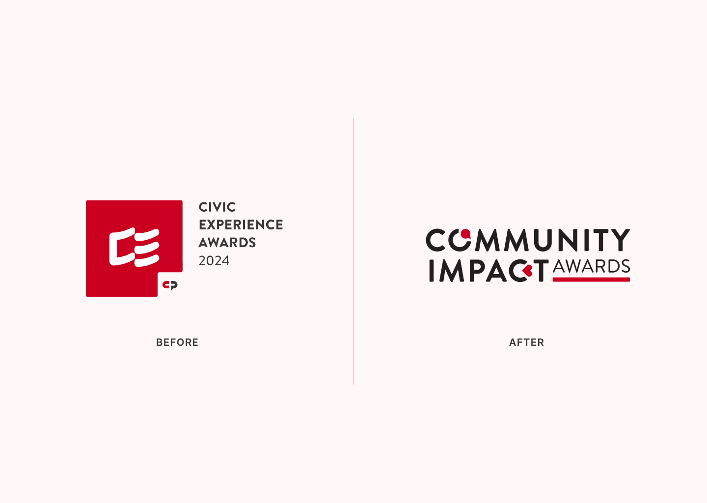
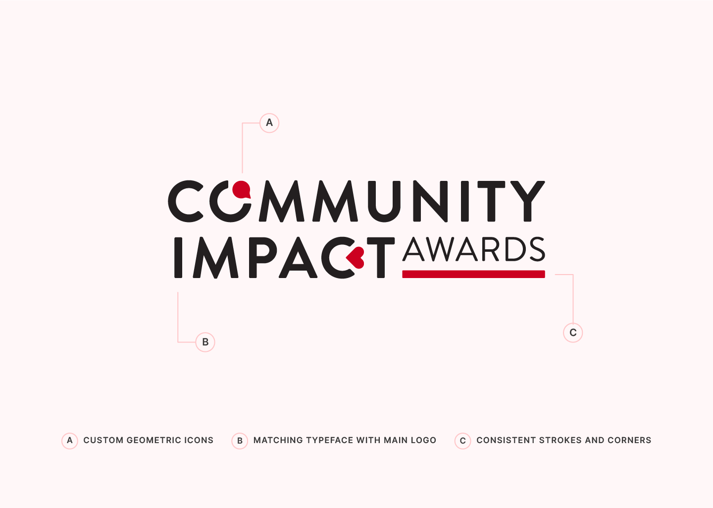
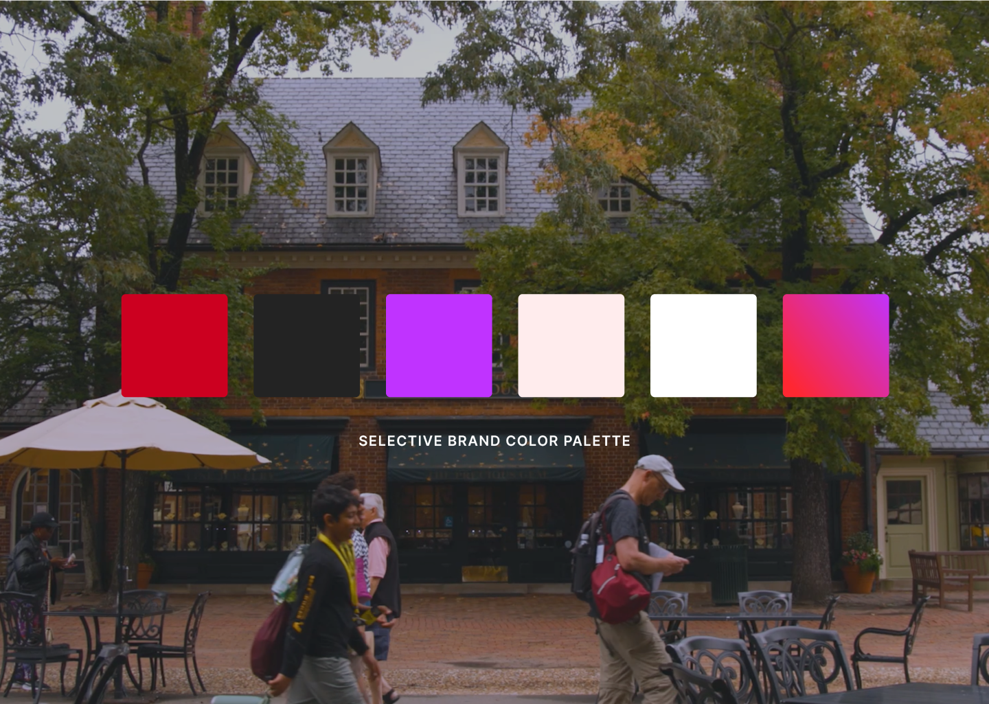
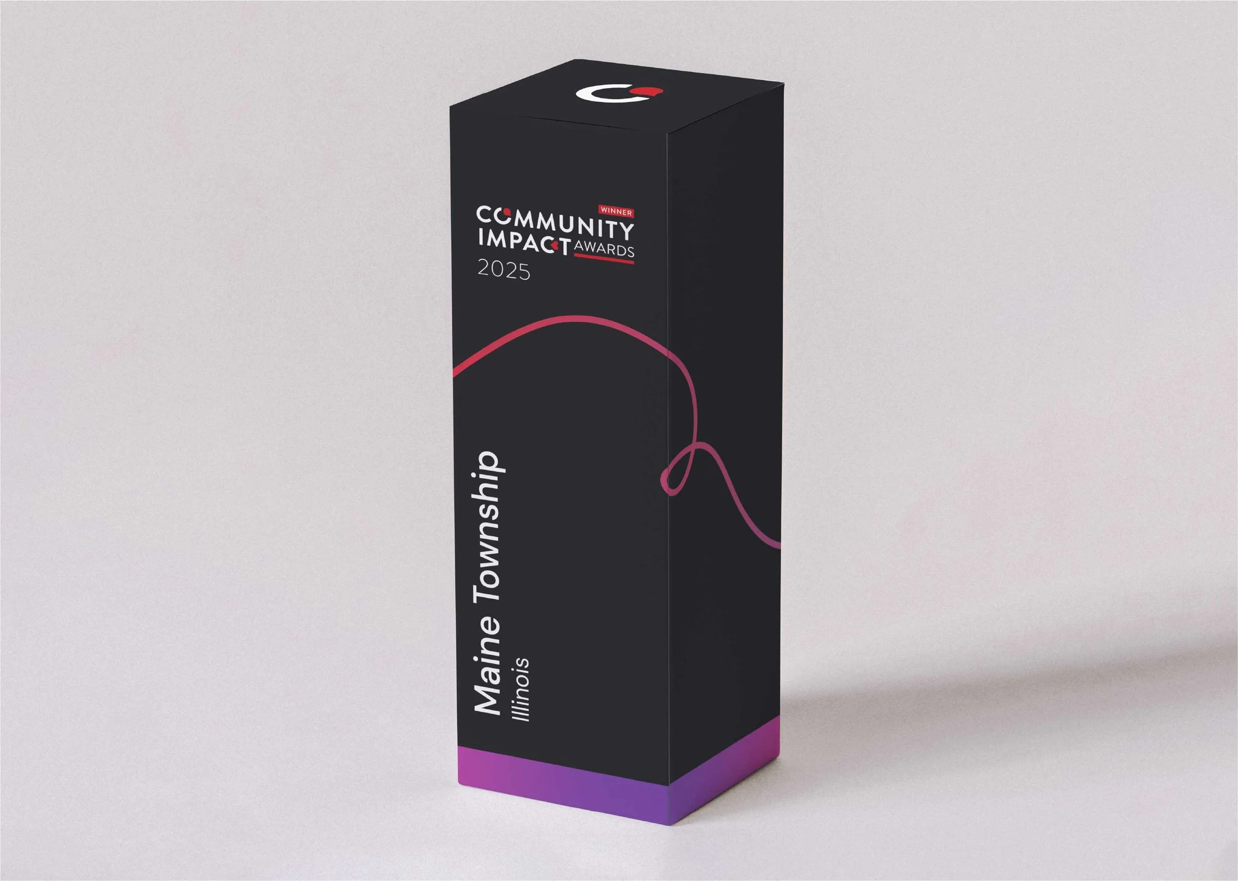
When I joined the CivicPlus marketing team in early 2025, the department had recently transitioned from agency to in-house produced content and creative. This allowed for a shift in strategy for a lot of the sub-branded systems at CivicPlus, including the push to better align the former Civic Experience Awards brand with company goals for 2025 and beyond. The Community Impact Awards rebrand took place over a nine week timeline and consisted of a new sub-branded design system including a fresh logo concept and supporting brand identity system. The new identity system was inspired by the program’s key themes: inclusivity, accessibility, approachability, and innovation.
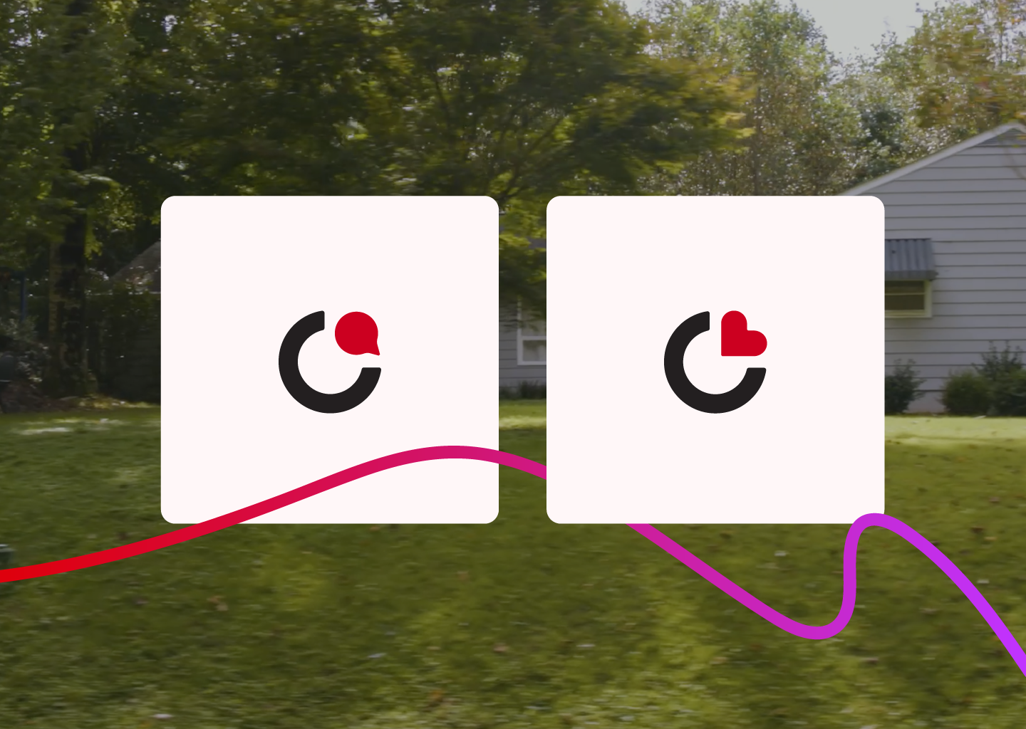
The final concept results in a compact logo that uses simplified geometric shapes to represent community (speech bubble) and impact (heart) in a custom-built type lockup. Both the speech bubble and heart are creatively nestled between letters creating a fun, approachable feel and a perfect rectangular shape without adding too much detail. The versatile logo pairs very nicely with all CivicPlus colors, and is a variation of the same font used for the CivicPlus logo (Brandon Grotesque). It’s friendly, to-the-point layout creates lots of opportunities for branded graphics using the geometric shapes combined with letters. Hand drawn line elements add to the identity giving it an airy feel, acting as a detail that ties communities together.
The Nomination Campaign
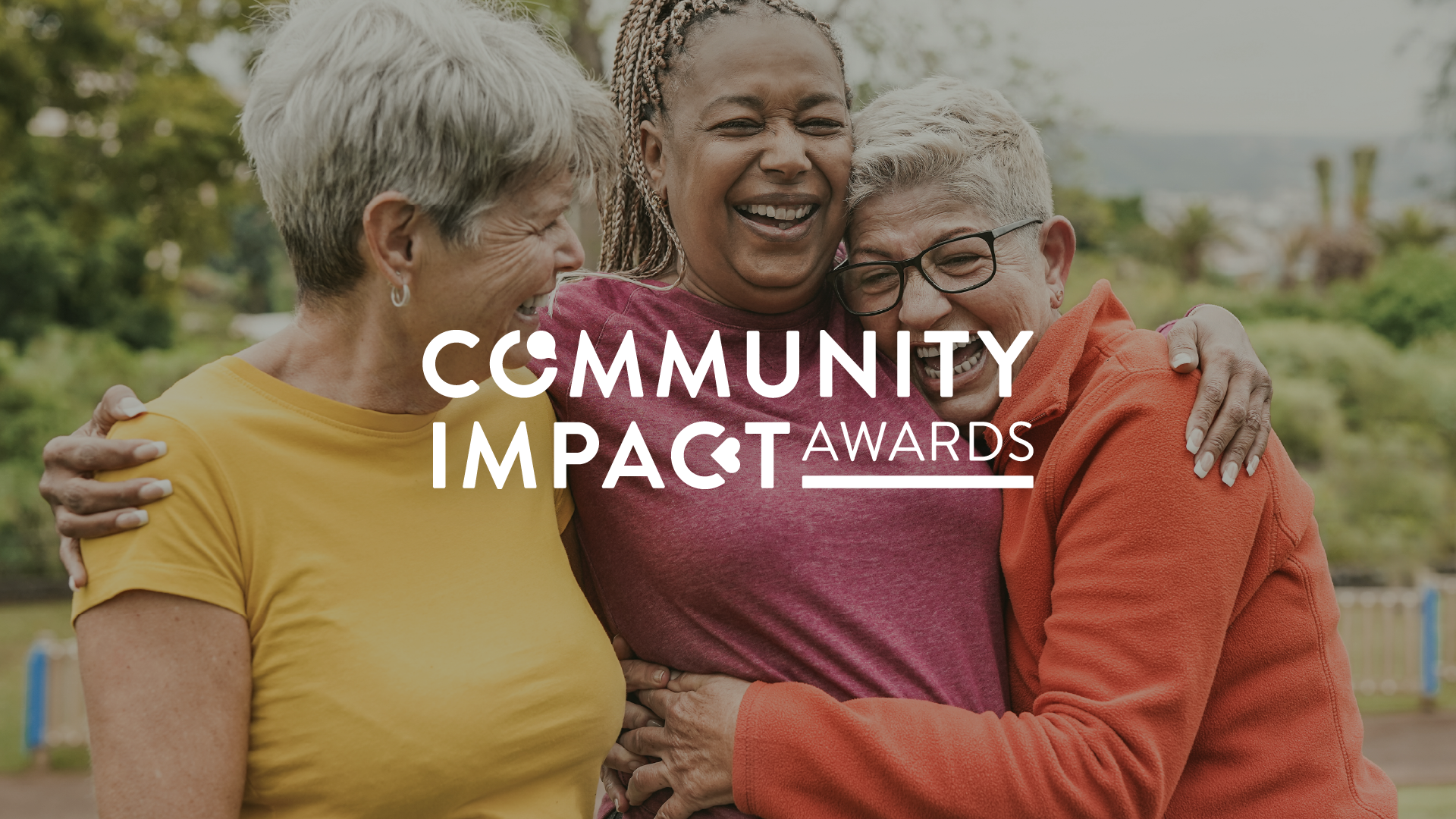
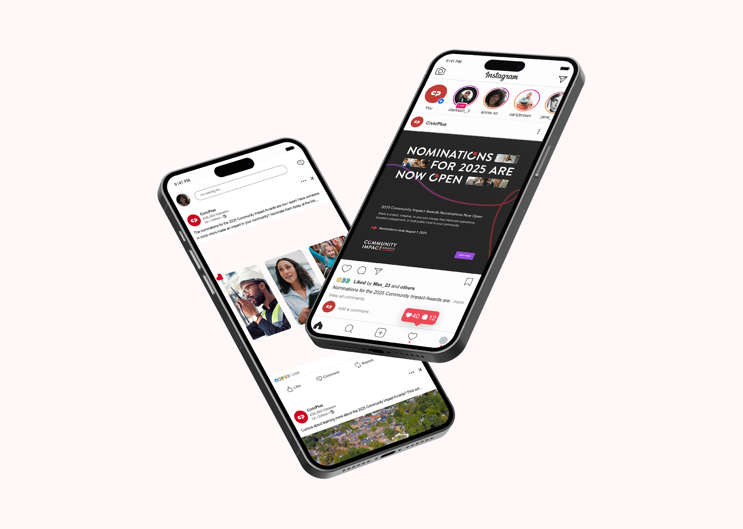
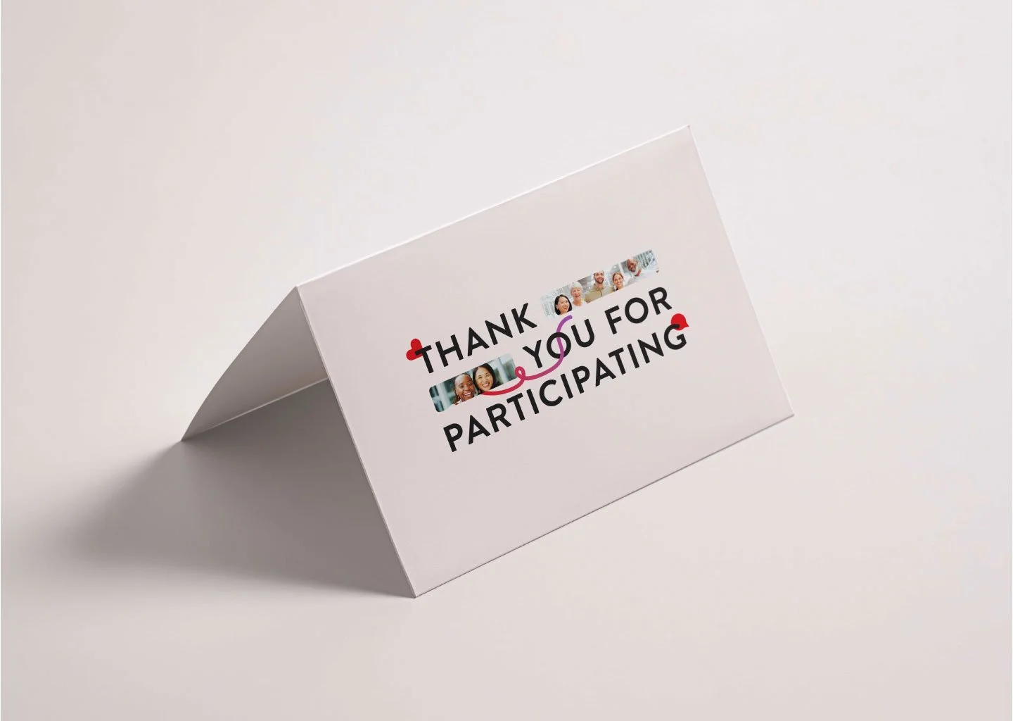
Once the new brand identity was established, it was time to attract nominations for the 2025 campaign. In early summer 2025, we launched the Community Impact Awards to hundreds of CivicPlus customers across the US. The nomination campaign reached customers mainly through internal communication via account representatives, but also made a splash on social media with both static and motion graphics campaigns.
I led the art direction and design for the brand’s first nomination video promoting the program’s kickoff, while collaborating alongside talented video and motion editor, Laurel Powers Miller. The campaign expanded on the brand’s approachability and positivity themes, using custom geometric shapes, a soft color palette, and hand drawn line elements to create a welcoming look and feel with the goal of enticing customers to apply.
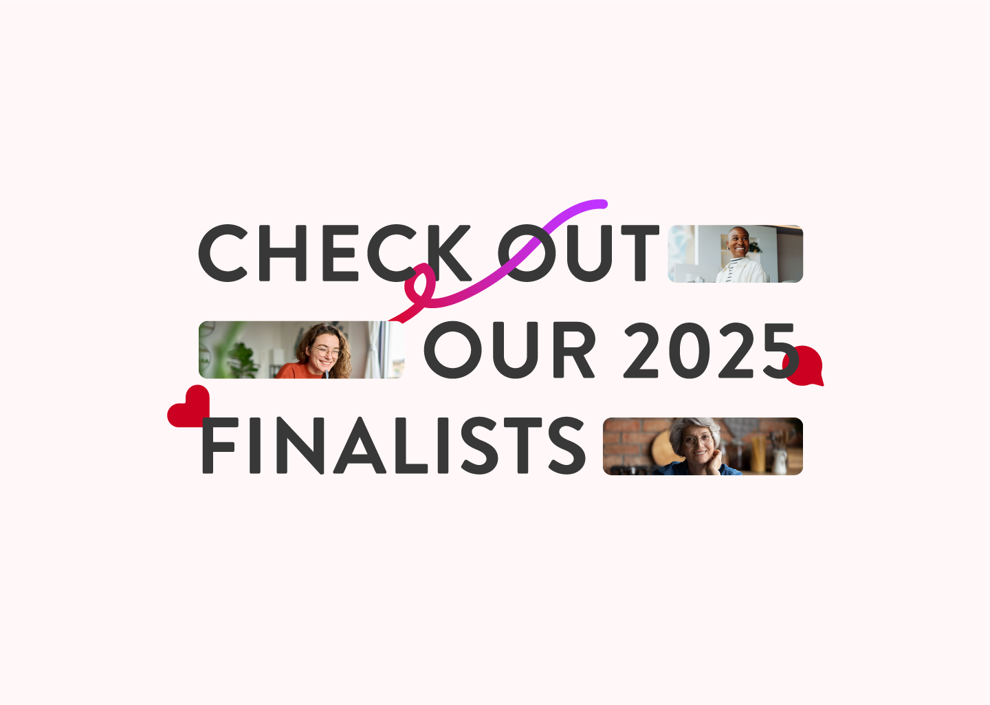
Community Impact Award Winners
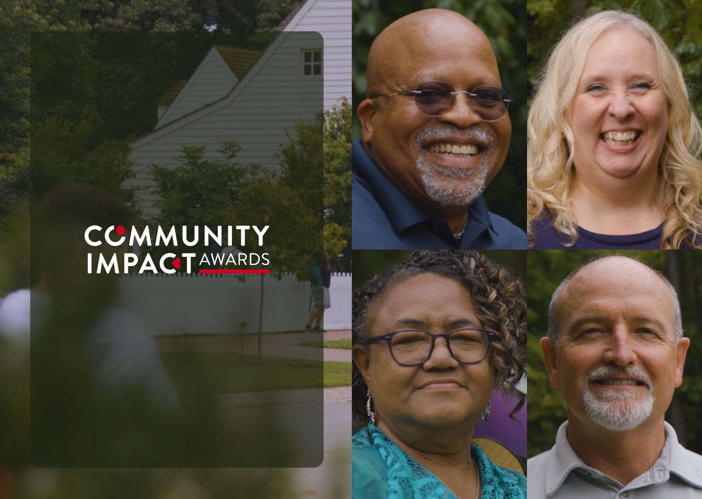
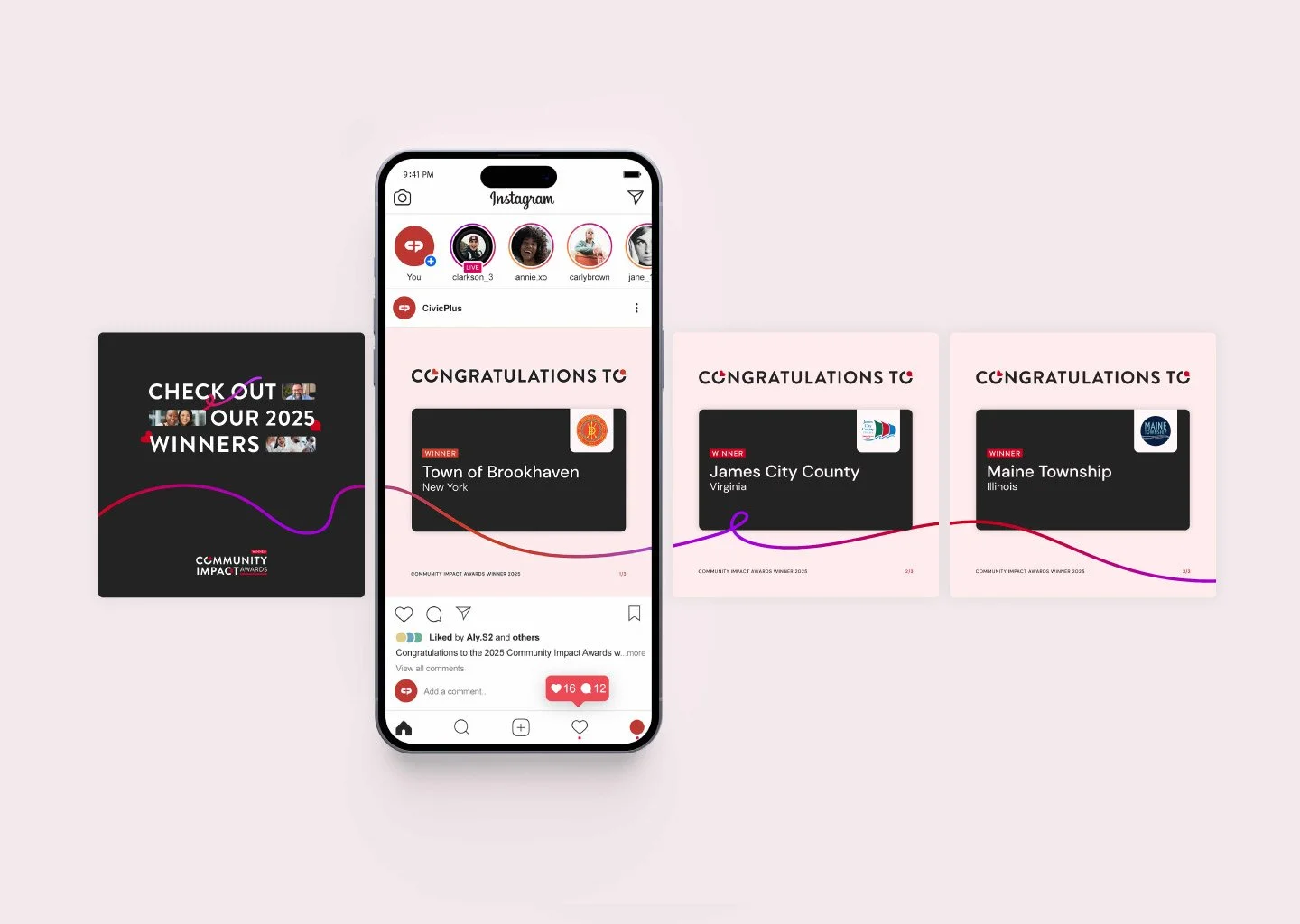
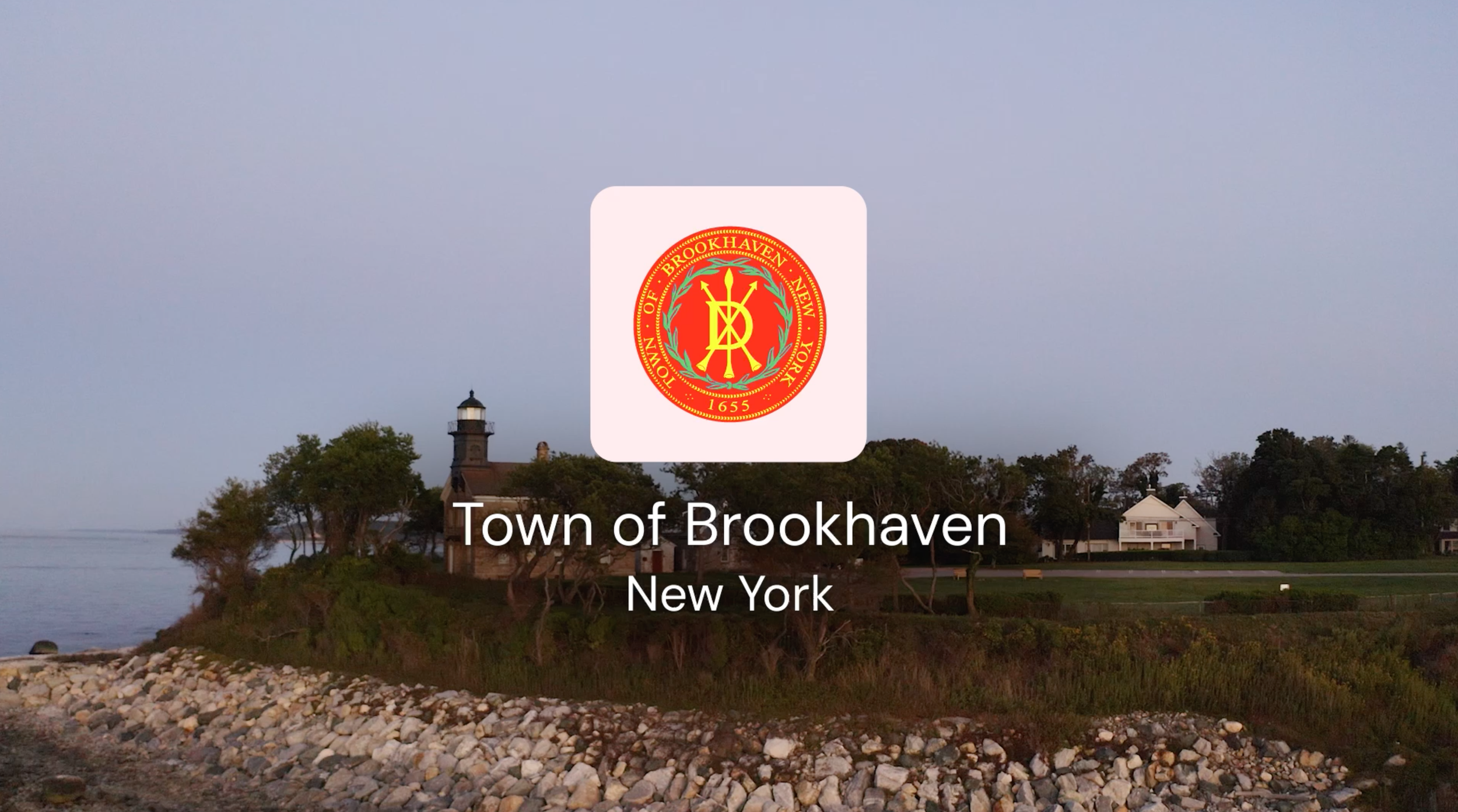
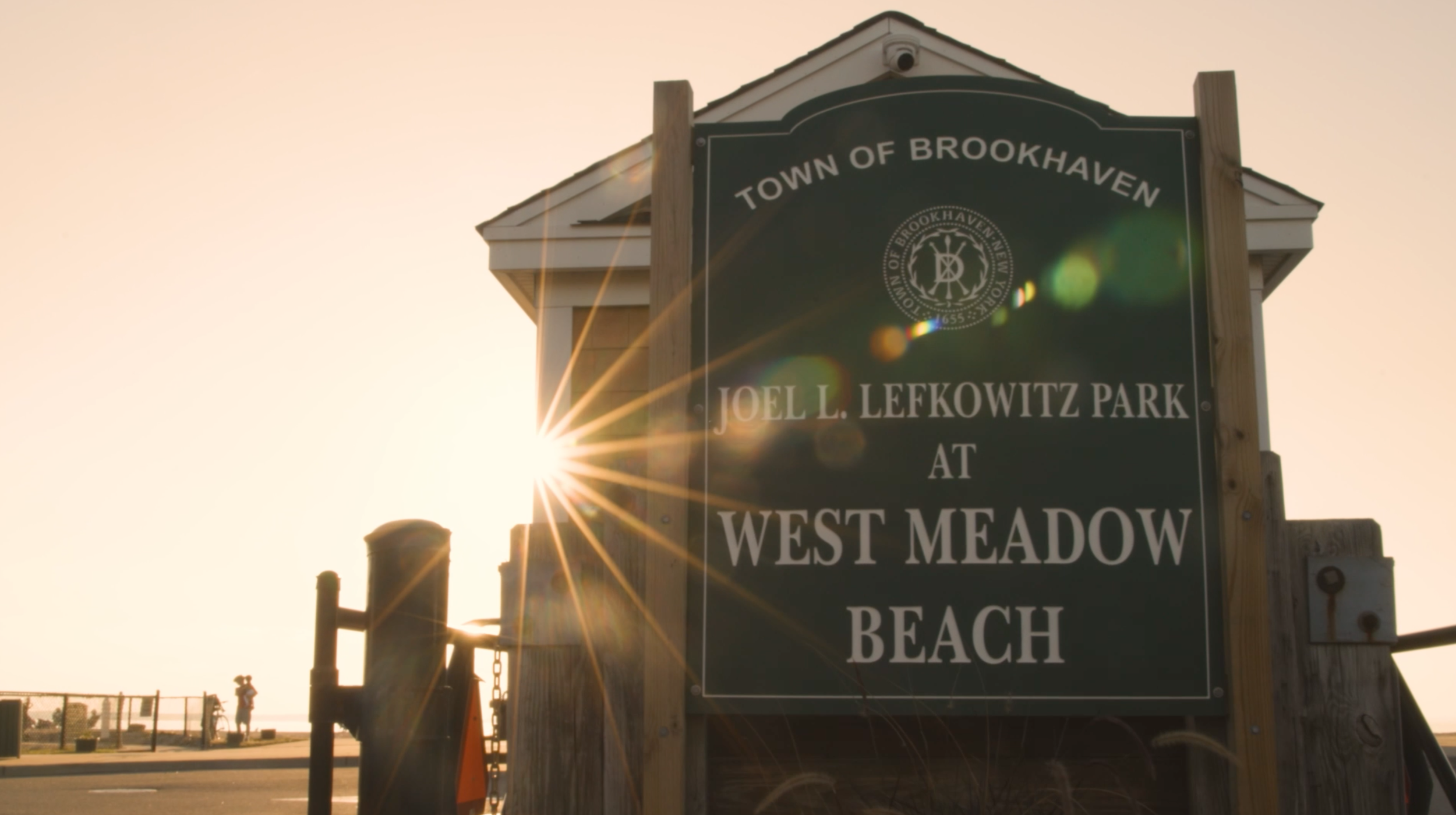
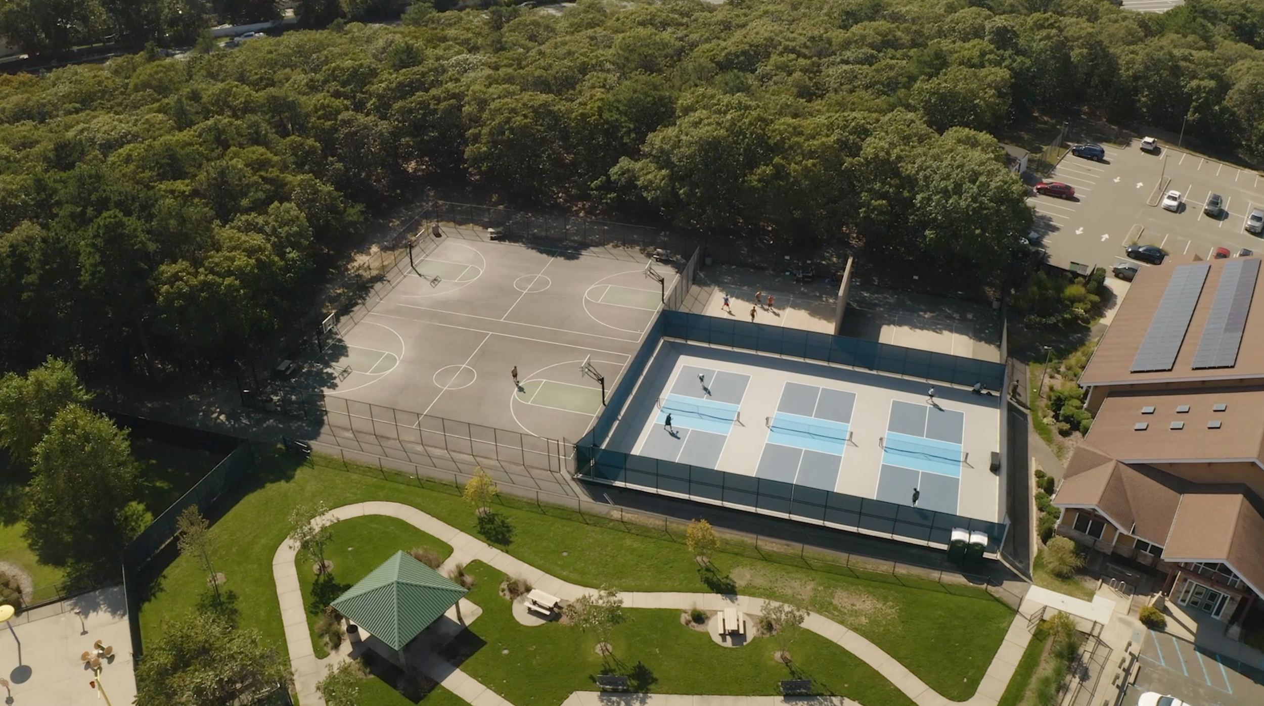
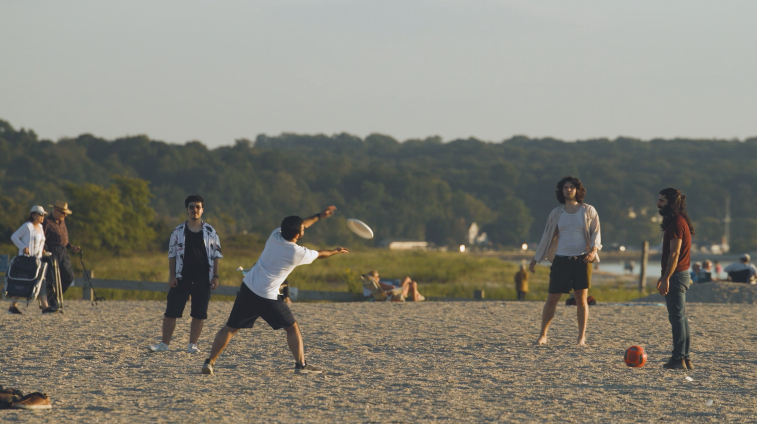
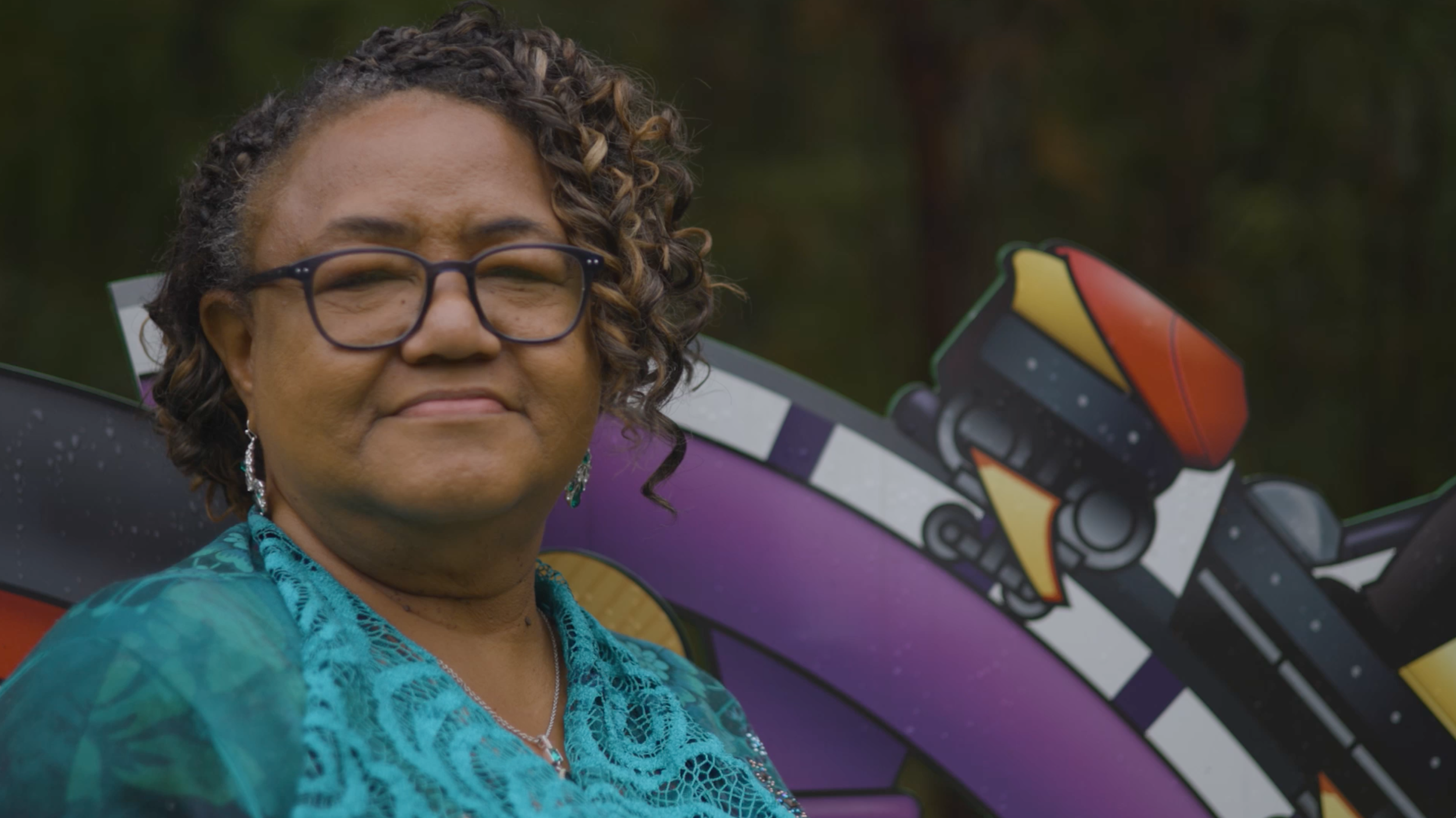
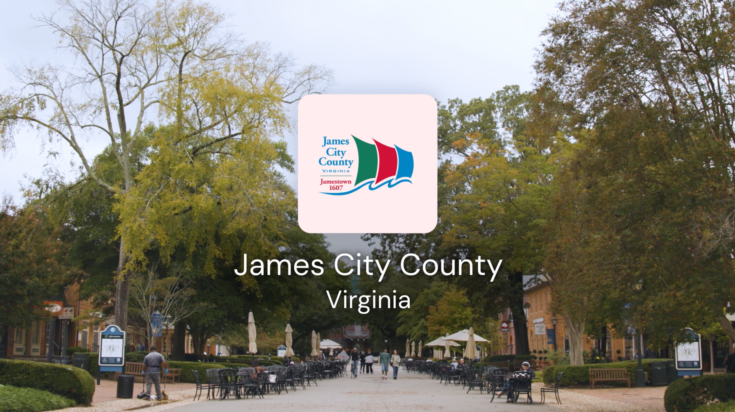
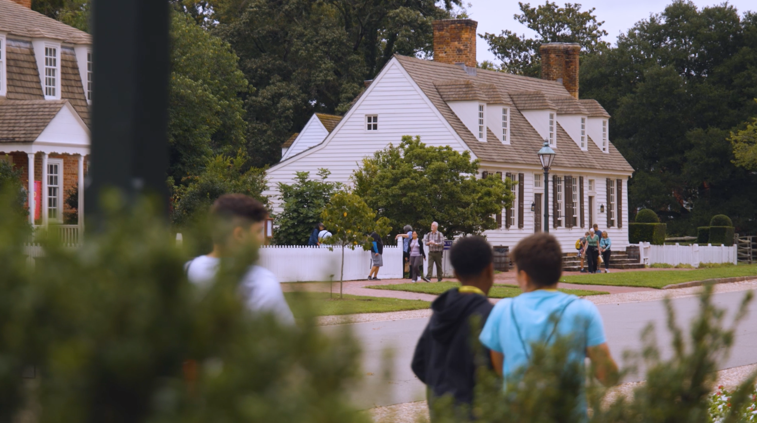
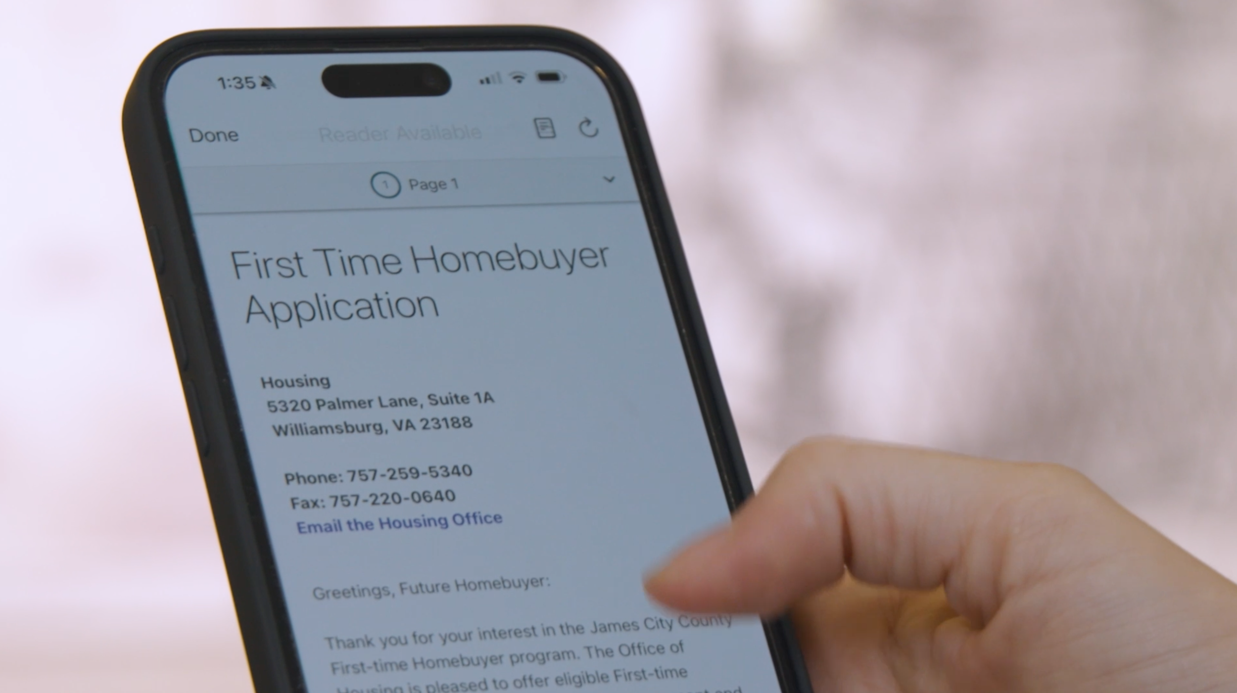
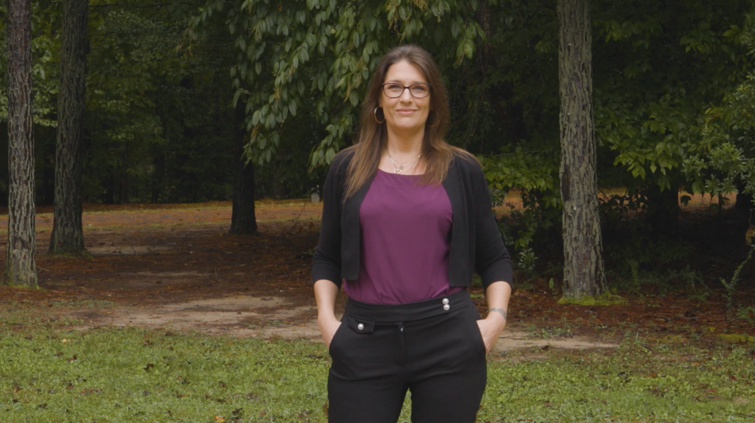
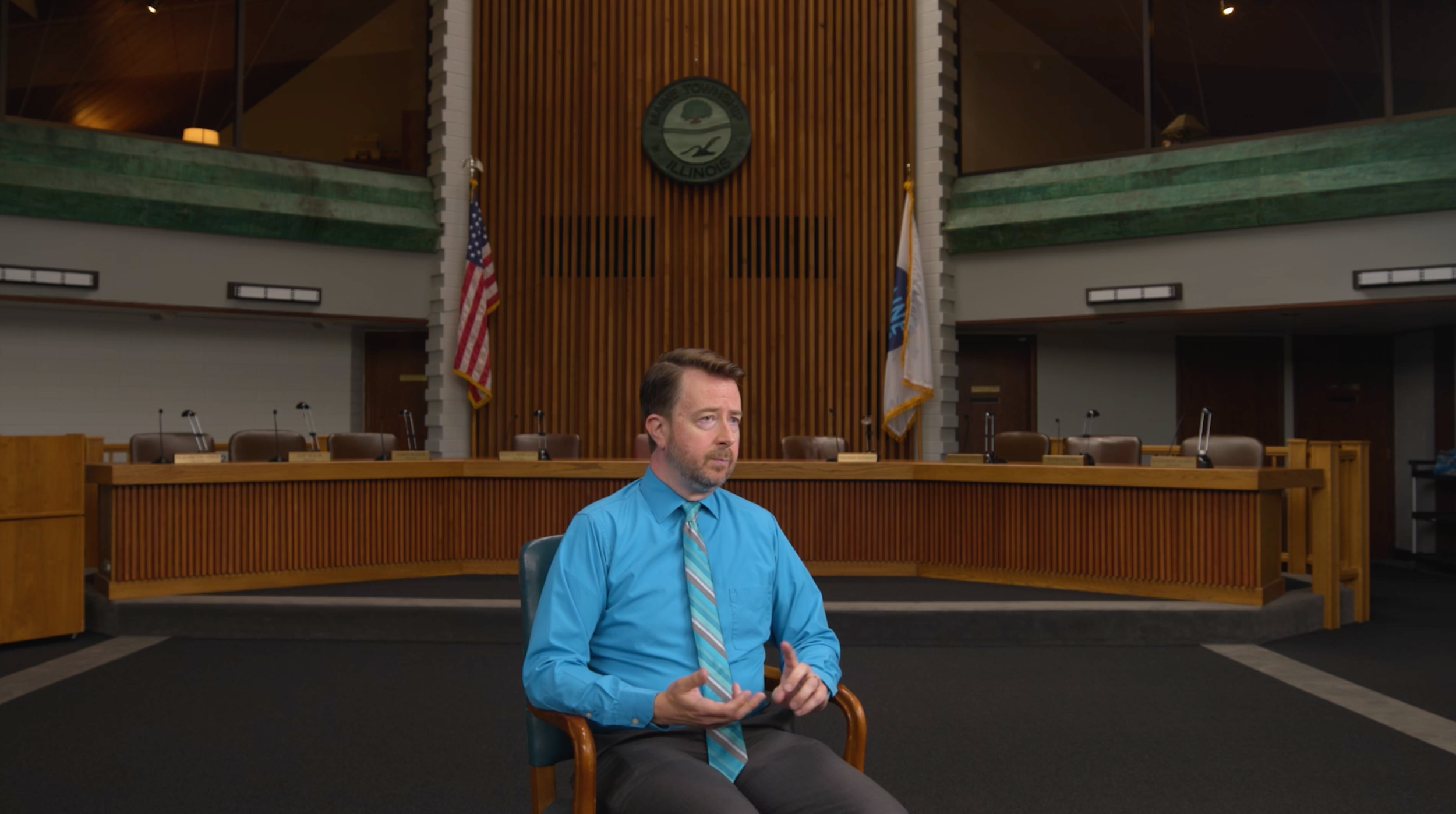
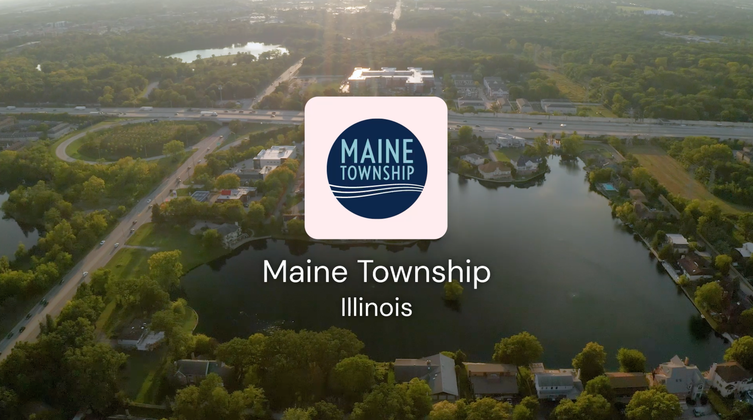
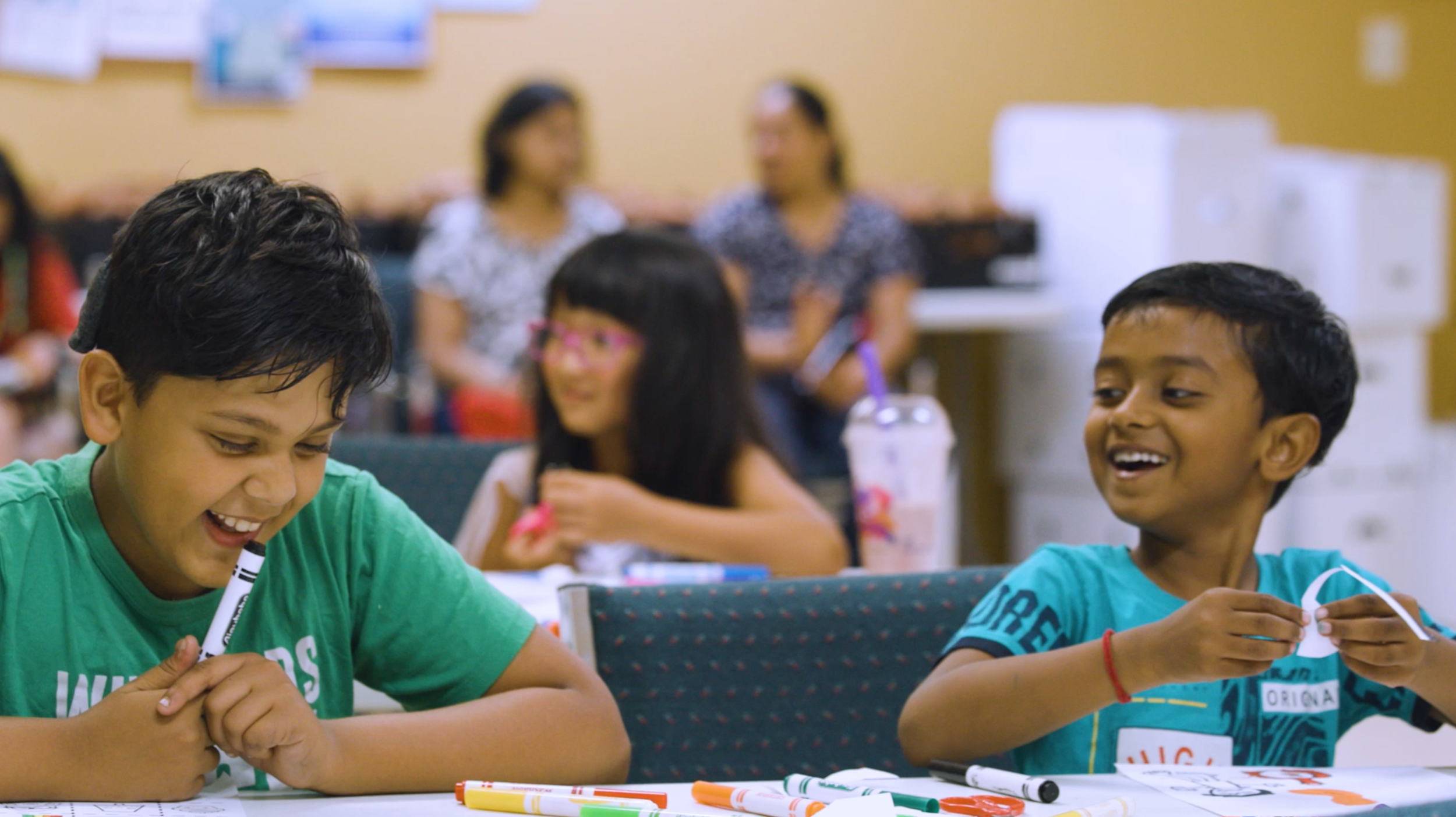
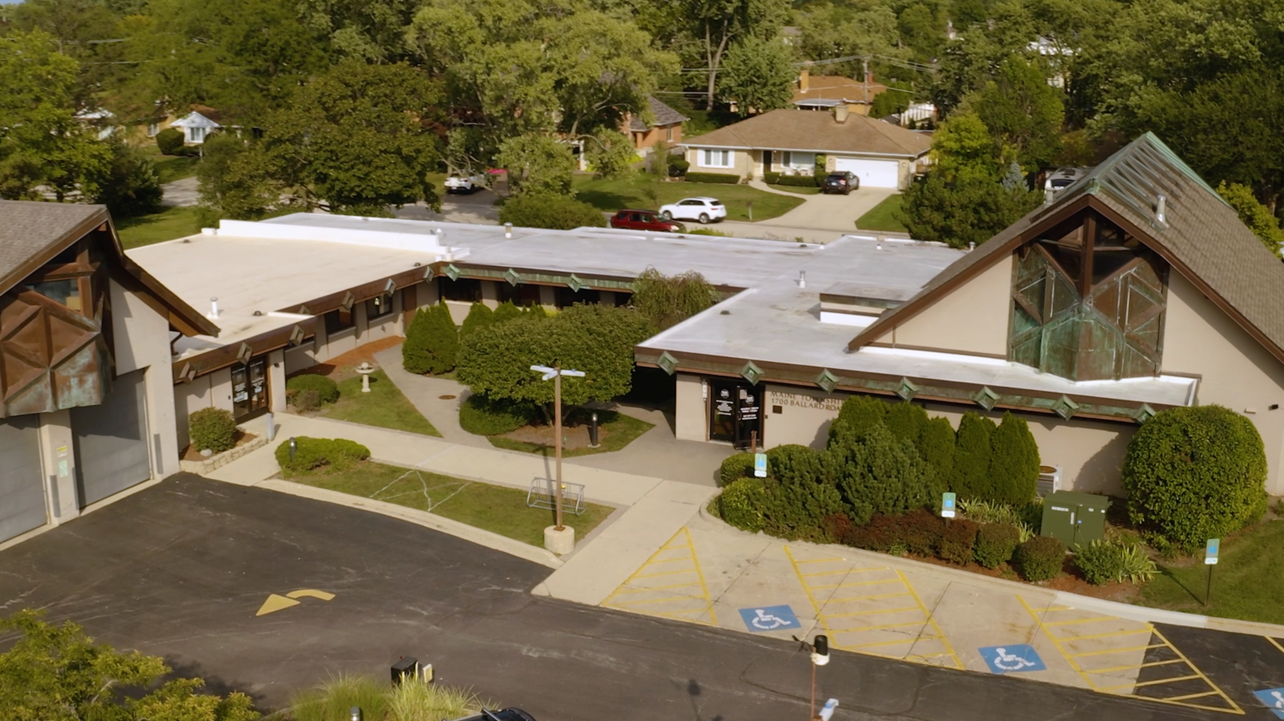
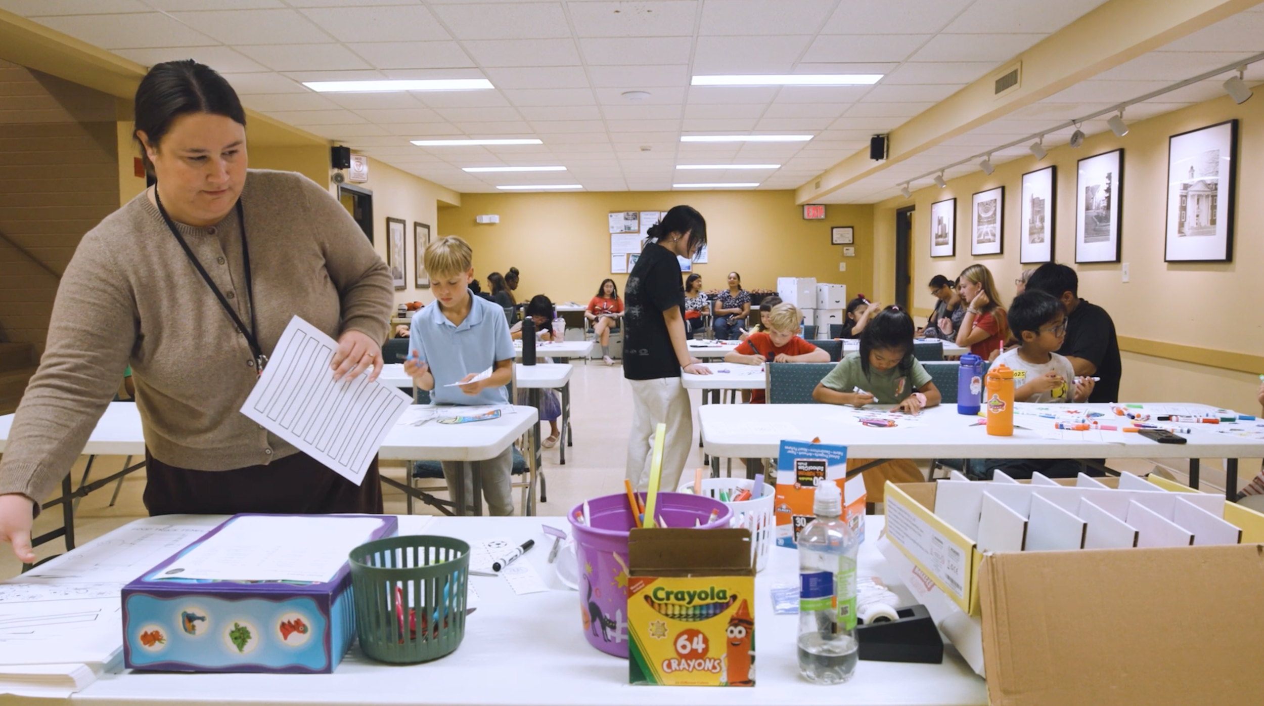
In November 2025, the top three winners were announced on CivicPlus socials and website, each receiving a charitable contribution for an impactful organization of their choice, a recognition trophy, and a professionally produced video highlighting their community story. We worked together with the three winners, The Town of Brookhaven, NY, James City County, VA, and Maine Township, IL to help showcase their empowering stories focusing on their strategy behind using CivicPlus products to drive positive impact within their communities.
I led the art direction and design for the program’s winners campaign while working alongside videographer Tyler Scott and motion and video editor Laurel Powers Miller. Subtle design elements from the rebrand were echoed in the interview series, such as a play on the logo for the lower third animation, hand drawn line details symbolizing togetherness, and a selective color palette. Overall, it was important for the design of these pieces to highlight the humbleness, vulnerability and transparency of each winner’s impactful story.
Final Thoughts
This project wasn't just one of my favorites to date, but won the hearts of numerous CivicPlus employees, C-Suite members, and customers. The successful launch of the rebranded design system resulted in an impressive 87% increase in program applicants from the previous year, and even led to closing the deal on a Q4 sale bringing in thousands in revenue for the company. Above all, I think my favorite part of this project was getting to hear the impactful stories from inspiring public-sector customers who care so deeply about improving their local communities. So much of the public sector is understaffed and underfunded, but their passion drives such positivity in times of uncertainty. It’s really rewarding bringing those stories to life, and I’m looking forward to keeping tabs on their success in the years to come.